
Page 3 - 2017 PIM Print Buyers Guide
P. 3
ABOUT THE COVER
COVER HIGHLIGHTS ABOUT THE IMAGE
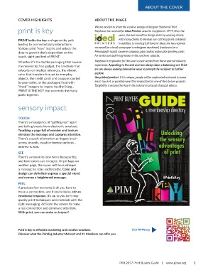
print is key We are excited to share the creative energy of designer Stephanie Yant.
Stephanie has worked for Ideal Printers since its inception in 1979. Over the
years, she has honed her design skills by working closely
PRINT holds the key and opens the path with many clients to develop eye-catching print collateral.
leading to connected daily interactions. In addition to working full-time for Ideal, she has received
Various print “keys” inspire and unlock the an award for a local newspaper’s redesigned masthead, freelances for a
door to growth that’s dependant on the Minneapolis-based souvenir company, plus creates watercolor greeting cards
touch, sight and feel of PRINT. for senior assisted living homes in the northern suburbs.
Whether it’s the tactile packaging that houses Stephanie’s inspiration for this year’s cover comes from those years of industry
the newest techno gadget, the brochure that experience. Appealing to the end user has always been a balancing act. Print-
educates on medical advances, the vibrant ers are always seeking innovative ways to prompt the recipient to further
color that transfers fine art to everyday explore
objects, the credit cards and coupons carried the printed product. If it’s unique, people will be captivated and want to exam-
in your wallet, or the packaged food with ine it, touch it, or possibly save it for inspiration for one of their future projects.
“fresh” imagery to inspire healthy living... Tangibility is yet another key in the industry’s arsenal of special effects.
PRINT IS THE KEY that connects the many
paths together.
sensory impact
TOUCH
There’s a resurgence of “getting real” again
and taking breaks from electronic overload.
Touching a page full of wonder and texture
elevates the message and captures attention.
There’s a spark of emotion as fingers brush
across smooth, rough or bumpy surfaces –
interest is won.
SEE
There’s a reason to look twice because big
and bold colors can energize. Or perhaps on
another page, the super soft hues whisper
a message to relax and breathe. Color and
design can definitely express a special mood
and convey a heightened message.
FEEL
A precious few moments is all you have to
make a connection, and if you’re lucky, stir an
emotional response. It’s up to you to fit top-
quality print techniques and materials with the
right messaging. Activate the senses to make
a real connection and command attention.
With print, you can make an impact!
Print is Key to effective marketing and creative solutions. Visit PIMW.org t
Discover what the Printing Industry Midwest and it’s Members can offer you.
PIM 2017 Print Buyers Guide | www.pimw.org 1