
Page 13 - Magazine Karel Martens
P. 13
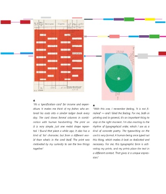
“It’s a ‘specification card’ for income and expen-
                        diture. It makes me think of my father, who en-  “With  this  one,  I  remember  feeling,  ‘It  is  not  fi-
                        tered  his  costs  into  a  similar  ledger  book  every   nished’ — and I liked the feeling. For me, both in
                        day.  The  card  shows  formal  columns  in  combi-  printing and in general, it’s an important thing to
                        nation  with  human  handwriting.  The  print  on   stop at the right moment. I’m also reacting to the
                        it  is  very  simple,  just  one  metal  shape  repea-  rhythm  of  typographical  order,  which  I  see  as  a
                        ted. I found that piece a while ago; it also has a   kind  of  concrete  poetry.  The  typewriting  on  the
                        kind of ‘list’ character, but from a different wor-  card is very formal. A human being once typed out
                        ld  than  what’s  in  the  card  itself.  The  print  was   this thing, which makes it look so dedicated and
                        motivated by my curiosity to see the two things    necessary. For me, this typographic form is acti-
                        together.”                              vating my prints, and my prints place the text in
                                                                a different context. That gives it a unique expres-
                                                                sion.”