
Page 287 - Windows 10 May 2019 Update The Missing Manual: The Book That Should Have Been in the Box
P. 287
POWER USERS’ CLINIC SOME CLEAR TALK
ABOUT CLEARTYPE
ClearType is Microsoft’s word for a sneaky technology that
makes type look sharper on your screen than it really is.
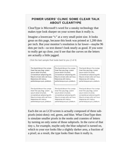
Imagine a lowercase “s” at a very small point size. It looks
great on this page, because this book was printed at 1,200 dots
per inch. But your monitor’s resolution is far lower—maybe 96
dots per inch—so text doesn’t look nearly as good. If you were
to really get up close, you’d see that the curves on the letters
are actually a little jagged.
Each dot on an LCD screen is actually composed of three sub ‐
pixels (mini-dots): red, green, and blue. What ClearType does
is simulate smaller pixels in the nooks and crannies of letters
by turning on only some of those subpixels. In the curve of that
tiny s, for example, maybe only the blue subpixel is turned on,
which to your eye looks like a slightly darker area, a fraction of
a pixel; as a result, the type looks finer than it really is.