
Page 29 - TCS ICT Book 6
P. 29
The City School 2021-2022
To make data labels easier to read, you can move them inside the data points or even
outside of the chart. To move a data label, drag it to the location you want. Excel allows
you to add chart elements such as chart titles, legends, and data labels to make your
chart easier to read.
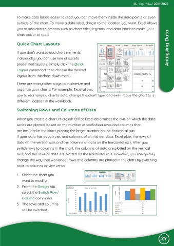
Quick Chart Layouts
If you don’t want to add chart elements Analysing Data
individually, you can use one of Excel’s
predefined layouts. Simply click the Quick
Layout command, then choose the desired
layout from the drop-down menu.
There are many other ways to customize and
organize your charts. For example, Excel allows
you to rearrange a chart’s data, change the chart type, and even move the chart to a
different location in the workbook.
Switching Rows and Columns of Data
When you create a chart, Microsoft Office Excel determines the axis on which the data
series are plotted, based on the number of worksheet rows and columns that
are included in the chart, placing the larger number on the horizontal axis.
If your data has equal rows and columns of worksheet data, Excel plots the rows of
data on the vertical axis and the columns of data on the horizontal axis. After you
switch rows to columns in the chart, the columns of data are plotted on the vertical
axis, and the rows of data are plotted on the horizontal axis. However, you can quickly
change the way that worksheet rows and columns are plotted in the chart by switching
rows to columns or vice versa.
1. Select the chart you
want to modify.
2. From the Design tab,
select the Switch Row/
Column command.
3. The rows and columns
will be switched.
29