
Page 2 - 4p-Logo-Guidelines
P. 2
Logo & Identity Guidelines
Client : Tom & Teddy
Positional & Spacial Considerations
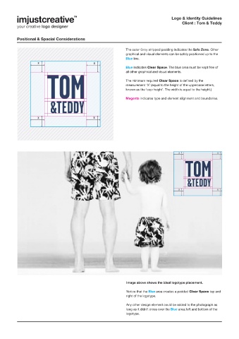
The outer Grey stripped padding indicates the Safe Zone. Other
graphical and visual elements can be safely positioned up to the
Blue line.
x x
Blue indicates Clear Space. The blue area must be kept free of
all other graphical and visual elements.
The minimum required Clear Space is defined by the
measurement ‘X’ (equal to the height of the uppercase letters,
known as the ‘cap-height’. The width is equal to the height.)
Magenta indicates type and element alignment and boundaries.
x x
x x
x x
Image above shows the ideal logotype placement.
Notice that the Blue area creates a padded Clear Space top and
right of the logotype.
Any other design element could be added to the photograph as
long as it didn’t cross over the Blue area; left and bottom of the
logotype.