
Page 652 - 9780077418427.pdf
P. 652
Volume/207/MHDQ243/tiL12214_disk1of1/0073512214/tiL12214_pagefile
tiL12214_appa_623-630.indd Page 629 09/10/10 8:36 AM user-f463
tiL12214_appa_623-630.indd Page 629 09/10/10 8:36 AM user-f463 Volume/207/MHDQ243/tiL12214_disk1of1/0073512214/tiL12214_pagefiles
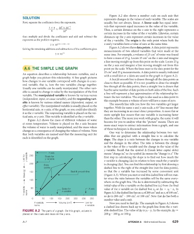
Figure A.2 also shows a number scale on each axis that
SOLUTION
represents changes in the values of each variable. The scales are
First, separate the coefficients from the exponents, usually, but not always, linear. A linear scale has equal inter-
4
−6
10 × 10
_ _ vals that represent equal increases in the value of the variable.
2 × 8
×
8 10 4 Thus, a certain distance on the x axis to the right represents a
certain increase in the value of the x variable. Likewise, certain
then multiply and divide the coefficients and add and subtract the distances up the y axis represent certain increases in the value
exponents as the problem requires. of the y variable. The origin is the only point where both the
2 × 10 [(4) + (−6)] − [4] x and y variables have a value of zero at the same time.
Figure A.2 shows three data points. A data point represents
Solving the remaining additions and subtractions of the coefficients gives
measurements of two related variables that were made at the
2 × 10 −6 same time. For example, a volume of 25 cm of water was found
3
3
to have a mass of 25 g. Locate 25 cm on the x axis and imagine
a line moving straight up from this point on the scale. Locate 25 g
on the y axis and imagine a line moving straight out from this
A.6 THE SIMPLE LINE GRAPH point on the scale. Where the lines meet is the data point for the
3
25 cm and 25 g measurements. A data point is usually indicated
An equation describes a relationship between variables, and a
with a small dot or x (dots are used in the graph in Figure A.2).
graph helps you picture this relationship. A line graph pictures
A best fit smooth line is drawn through all the data points as
how changes in one variable correspond with changes in a sec-
close to them as possible. If it is not possible to draw the straight
ond variable, that is, how the two variables change together.
line through all the data points, then a straight line is drawn that
Usually one variable can be easily manipulated. The other vari-
has the same number of data points on both sides of the line. Such
able is caused to change in value by the manipulation of the first
a line will represent a best approximation of the relationship be-
variable. The manipulated variable is known by various names
tween the two variables. The origin is also used as a data point in
(independent, input, or cause variable), and the responding vari-
this example because a volume of zero will have a mass of zero.
able is known by various related names (dependent, output, or
The smooth line tells you how the two variables get larger
eff ect variable). The manipulated variable is usually placed on the
together. With the same x and y axis scale, a 45° line means that
horizontal axis, or x axis, of the graph, so you could also identify
they are increasing in an exact direct proportion. A more flat or
it as the x variable. The responding variable is placed on the ver-
more upright line means that one variable is increasing faster
tical axis, or y axis. This variable is identified as the y variable.
than the other. The more you work with graphs, the easier it will
Figure A.2 shows the mass of different volumes of water
become for you to analyze what the “picture” means. There are
at room temperature. Volume is placed on the x axis because
more exact ways to extract information from a graph, and one
the volume of water is easily manipulated, and the mass values
of these techniques is discussed next.
change as a consequence of changing the values of volume. Note
One way to determine the relationship between two vari-
that both variables are named and that the measuring unit for
ables that are graphed with a straight line is to calculate the
each is identified on the graph.
slope. The slope is a ratio between the changes in one variable
and the changes in the other. The ratio is between the change
in the value of the x variable and the change in the value of the
y variable. Recall that the symbol Δ (Greek letter capital delta)
Y axis
means “change in,” so the symbol Δx means the “change in x.” The
Unit for y variable 250 Scale for first step in calculating the slope is to find out how much the
y variable
x variable is changing (Δx) in relation to how much the y variable
200
Data is changing (Δy). You can find this relationship by first drawing a
points dashed line to the right of the straight line (not the data points),
Mass (g) 150 Best fit smooth line so that the x variable has increased by some convenient unit
( Figure A.3). Where you start or end this dashed line will not mat-
100 ter since the ratio between the variables will be the same every-
where on the graph line. The Δx is determined by subtracting the
initial value of the x variable on the dashed line (x i ) from the final
Y variable name Scale for X axis value of the x variable on the dashed line x f , or Δx = x f – x i . In
50
x variable
3
3
Figure A.3, the dashed line has an x f of 200 cm and an x i of 100 cm ,
3
3
3
so Δx is 200 cm – 100 cm , or 100 cm . Note that Δx has both a
0 50 100 150 200 250 300 350
number value and a unit.
X variable Volume (cm ) 3 Unit for Now you need to find Δy. The example in Figure A.3 shows
name x variable
a dashed line drawn back up to the graph line from the x vari-
able dashed line. The value of Δy is y f – y i . In the example, Δy =
FIGURE A.2 The parts of a graph. On this graph, volume is
placed on the x axis and mass on the y axis. 200 g – 100 g, or 100 g.
A-7 APPENDIX A Mathematical Review 629