
Page 122 - Learn To Use HTML and CSS
P. 122
So You Want to Learn to Use HTML and CSS – Version 2020-06-12a Page 112
Chapter 11 — Responsive CSS
Media Features (@media with Sizes)
Free
We can create additional rules that include ranges of screen sizes and orientations to change the
presentation. These responsive rules allow for a single HTML page to be displayed on a variety
of devices and still look great.
Because of the huge variety of devices, it is impossible to target our pages to each and every one
eBook
of them. With this in mind, we can think about screens based upon their width, and define our
CSS accordingly.
It is recommended that we design our page "Mobile First". You may find it easier to start your
CSS layout for the smallest devices. Once you are satisfied, you can add a break-point (@media
rule) for the tablet and then one for the PC screen.
Edition
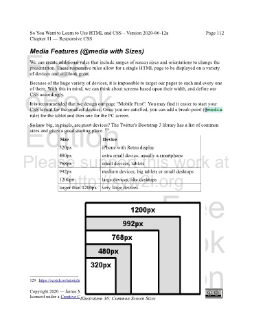
So how big, in pixels, are most devices? The Twitter's Bootstrap 3 library has a list of common
129
sizes and gives a good starting place.
Device
Size
320px
iPhone with Retna display
480px
Please support this work at
extra small device, usually a smartphone
small devices, tablets
768px
992px medium devices, big tablets or small desktops
http://syw2l.org
1200px large devices, like desktops
larger than 1200px very large devices
Free
eBook
Edition
129 https://scotch.io/tutorials/default-sizes-for-twitter-bootstraps-media-queries
Copyright 2020 — James M. Reneau PhD — http://www.syw2l.org — This work is
licensed under a Creative Commons Attribution-ShareAlike 4.0 International License.
Illustration 36: Common Screen Sizes
