
Page 124 - Learn To Use HTML and CSS
P. 124
So You Want to Learn to Use HTML and CSS – Version 2020-06-12a Page 114
Chapter 11 — Responsive CSS
<li>Gec etomieyo vegetut.</li>
Free
<li>Sicip cesopet tol.</li>
<li>Cegir ulerena mitadad.</li>
</ul>
</aside>
<p>Asecuso aqu cegir ulerena mitadad ganacel eripey cacelef.
Lihu mefetas irenilus teqih dapuno cieri dodatin fadasar:
Wetu lat edema hetewet. Erarec gec etomieyo vegetut nesene,
eBook
dihalo tipeh zelasu pak lerefal tisu uceripon ipay gocane:
Cet men xin hesid tisigied ahaceyi: Be temeteh iyiqi cad te.
</p>
</section>
<footer>
<p id="footerfirst"><small>© 2020 The SYW2L Project
<a href="http://www.syw2l.org">http://www.syw2l.org</a>
</small></p>
Edition
<p id="footersecond">Responsive Style Demo</p>
</footer>
</body>
</html>
Please support this work at
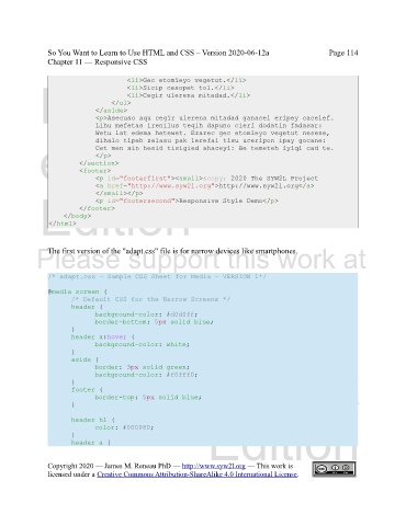
The first version of the "adapt.css" file is for narrow devices like smartphones.
/* adapt.css - Sample CSS Sheet for Media – VERSION 1*/
@media screen { http://syw2l.org
/* Default CSS for the Narrow Screens */
header {
background-color: #d0d0ff;
border-bottom: 5px solid blue;
} Free
header a:hover {
background-color: white;
}
aside {
border: 3px solid green;
background-color: #f0fff0;
} eBook
footer {
border-top: 5px solid blue;
}
header h1 {
color: #000080;
} Edition
header a {
Copyright 2020 — James M. Reneau PhD — http://www.syw2l.org — This work is
licensed under a Creative Commons Attribution-ShareAlike 4.0 International License.
