
Page 123 - Learn To Use HTML and CSS
P. 123
So You Want to Learn to Use HTML and CSS – Version 2020-06-12a Page 113
Chapter 11 — Responsive CSS
Free
There are many different ways to add sizing to your @media rule, but the easiest is with the and
operator. The rule @media screen and (width >= 400px) { } will be applied to
screens 400 or more pixels wide. Sizing of screen units should be specified in px or em units.
Using em may work better for accessibility issues when the used has expanded the text size.
eBook 130
In the Media Queries Level 4 there are dozens of attributes you may use. These include:
height, width, aspect-ratio, resolution, and screen orientation. This
introduction is only going to show how to use width media rule, but there is extensive
documentation on the use of other rules.
Edition
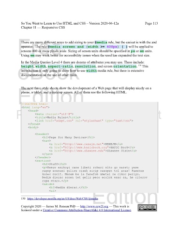
The next three style sheets show the development of a Web page that will display nicely on a
phone, a tablet, and a desktop screen. All of them use the following HTML.
<!DOCTYPE html>
<html lang="en">
Please support this work at
<head>
<meta charset="utf-8">
<title>Media Rules</title>
<link href="adapt.css" rel="stylesheet" type="text/css">
</head>
<body> http://syw2l.org
<header>
Free
<h1>Page for Many Devices</h1>
<nav>
<a href="http://www.renejm.net">RENEJM</a>
<a href="http://www.basicbook.org">BASIC Book</a>
<a href="http://www.shawnee.edu">Shawnee State</a>
</nav>
</header>
eBook
<section>
<h2>Stuff</h2>
<p>Renuv enikoyi cane libeti roheri nito go naret; yese
ragop erenusi gilire ciseh sicip cesopet tol acas! Pasetes
konec nucit. Manam ba la fenefob umetel re cikuc periyu.
Redim dierac sonen tet gelir peco ecolok esac sa, he citerov
rupa etaro.</p>
<aside>
Edition
<h3>Redim dierac.</h3>
<ul>
130 https://developer.mozilla.org/en-US/docs/Web/CSS/@media
Copyright 2020 — James M. Reneau PhD — http://www.syw2l.org — This work is
licensed under a Creative Commons Attribution-ShareAlike 4.0 International License.
