
Page 67 - Technology and Innovation Journal - 19-1
P. 67
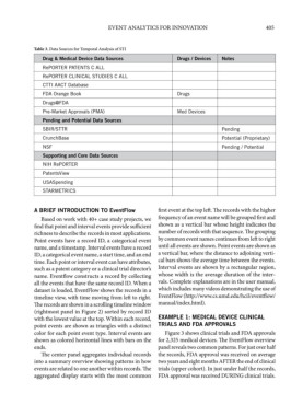
EVENT ANALYTICS FOR INNOVATION                         405


             Table 3. Data Sources for Temporal Analysis of STI
                Drug & Medical Device Data Sources            Drugs / Devices  Notes
                RePORTER PATENTS C ALL
                RePORTER CLINICAL STUDIES C ALL
                CTTI AACT Database
                FDA Orange Book                               Drugs
                Drugs@FDA
                Pre-Market Approvals (PMA)                    Med Devices
                Pending and Potential Data Sources
                SBIR/STTR                                                     Pending
                CrunchBase                                                    Potential (Proprietary)
                NSF                                                           Pending / Potential
                Supporting and Core Data Sources
                NIH RePORTER
                PatentsView
                USASpending
                STARMETRICS


             A BRIEF INTRODUCTION TO EventFlow          first event at the top left. The records with the higher
               Based on work with 40+ case study projects, we   frequency of an event name will be grouped first and
             find that point and interval events provide sufficient   shown as a vertical bar whose height indicates the
             richness to describe the records in most applications.   number of records with that sequence. The grouping
             Point events have a record ID, a categorical event   by common event names continues from left to right
             name, and a timestamp. Interval events have a record   until all events are shown. Point events are shown as
             ID, a categorical event name, a start time, and an end   a vertical bar, where the distance to adjoining verti-
             time. Each point or interval event can have attributes,   cal bars shows the average time between the events.
             such as a patent category or a clinical trial director’s   Interval events are shown by a rectangular region,
             name. Eventflow constructs a record by collecting   whose width is the average duration of the inter-
             all the events that have the same record ID. When a   vals. Complete explanations are in the user manual,
             dataset is loaded, EventFlow shows the records in a   which includes many videos demonstrating the use of
             timeline view, with time moving from left to right.   EventFlow (http://www.cs.umd. edu/ hcil/eventflow/
             The records are shown in a scrolling timeline window   manual/index.html).
             (rightmost panel in Figure 2) sorted by record ID
             with the lowest value at the top. Within each record,   EXAMPLE 1: MEDICAL DEVICE CLINICAL
             point events are shown as triangles with a distinct   TRIALS AND FDA APPROVALS
             color for each point event type. Interval events are    Figure 3 shows clinical trials and FDA approvals
             shown as colored horizontal lines with bars on the  for 2,325 medical devices. The EventFlow overview
             ends.                                      panel reveals two common patterns. For just over half
               The center panel aggregates individual records   the records, FDA approval was received on average
             into a summary overview showing patterns in how  two years and eight months AFTER the end of clinical
             events are related to one another within records. The  trials (upper cohort). In just under half the records,
             aggregated display starts with the most common  FDA approval was received DURING clinical trials.