
Page 136 - Jolliffe I. Principal Component Analysis
P. 136
5.4. Correspondence Analysis
105
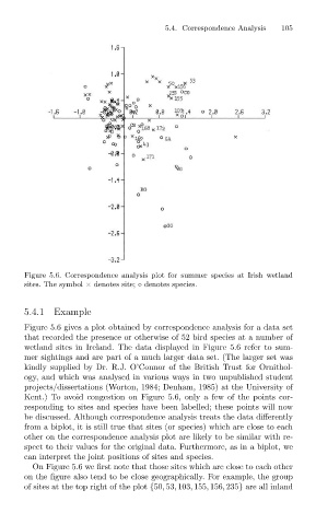
Figure 5.6. Correspondence analysis plot for summer species at Irish wetland
sites. The symbol × denotes site; ◦ denotes species.
5.4.1 Example
Figure 5.6 gives a plot obtained by correspondence analysis for a data set
that recorded the presence or otherwise of 52 bird species at a number of
wetland sites in Ireland. The data displayed in Figure 5.6 refer to sum-
mer sightings and are part of a much larger data set. (The larger set was
kindly supplied by Dr. R.J. O’Connor of the British Trust for Ornithol-
ogy, and which was analysed in various ways in two unpublished student
projects/dissertations (Worton, 1984; Denham, 1985) at the University of
Kent.) To avoid congestion on Figure 5.6, only a few of the points cor-
responding to sites and species have been labelled; these points will now
be discussed. Although correspondence analysis treats the data differently
from a biplot, it is still true that sites (or species) which are close to each
other on the correspondence analysis plot are likely to be similar with re-
spect to their values for the original data. Furthermore, as in a biplot, we
can interpret the joint positions of sites and species.
On Figure 5.6 we first note that those sites which are close to each other
on the figure also tend to be close geographically. For example, the group
of sites at the top right of the plot {50, 53, 103, 155, 156, 235} are all inland