
Page 22 - TCS ICT Book 7
P. 22
The City School 2021-2022
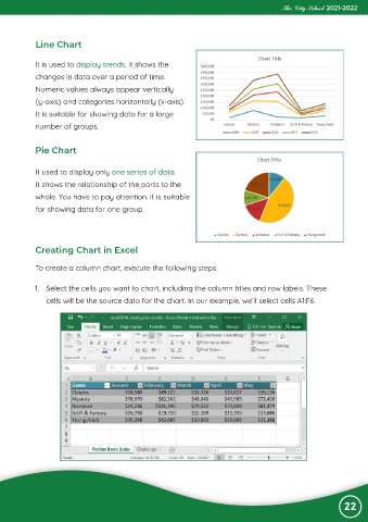
Line Chart
It is used to display trends. It shows the
changes in data over a period of time.
Numeric values always appear vertically
(y-axis) and categories horizontally (x-axis).
It is suitable for showing data for a large
number of groups.
Pie Chart
It used to display only one series of data.
It shows the relationship of the parts to the
whole. You have to pay attention. It is suitable
for showing data for one group.
Creating Chart in Excel
To create a column chart, execute the following steps:
1. Select the cells you want to chart, including the column titles and row labels. These
cells will be the source data for the chart. In our example, we’ll select cells A1:F6.
22