
Page 128 - Learn To Use HTML and CSS
P. 128
So You Want to Learn to Use HTML and CSS – Version 2020-06-12a Page 118
Chapter 11 — Responsive CSS
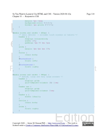
margin: 5px 10px;
Free
background-color: #c0c0c0;
border: 3px groove #7f7f7f;
}
}
@media screen and (width > 480px) {
/* small devices - includes touch screens on tablets */
eBook
header a {
display: inline-block;
width: 20%;
padding: 0px 5% 0px 0px;
}
aside {
margin: 0px 0px 0px 20%;
}
Edition
footer {
clear: both;
}
#footerfirst {
} float: left;
#footersecond {
Please support this work at
float: right;
}
}
http://syw2l.org
@media screen and (width > 990px) {
/* medium, large and very large screens */
header {
display: grid;
grid-template-columns: 1fr 11em;
}
header nav { Free
display: grid;
grid-template-columns: 10em;
}
header a {
width: inherit;
}
section { eBook
clear: both;
}
aside {
float: right;
}
Edition
}
Copyright 2020 — James M. Reneau PhD — http://www.syw2l.org — This work is
licensed under a Creative Commons Attribution-ShareAlike 4.0 International License.
