
Page 73 - TCS ICT Book 4
P. 73
The City School 2021-2022
Open an Excel sheet and enter any day, month or number and hold down right
button and move horizontally or vertically. The next value will be automatically
filled in. Spreadsheet Formatting
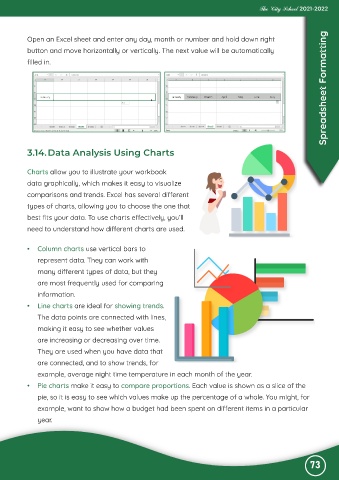
3.14. Data Analysis Using Charts
Charts allow you to illustrate your workbook
data graphically, which makes it easy to visualize
comparisons and trends. Excel has several different
types of charts, allowing you to choose the one that
best fits your data. To use charts effectively, you’ll
need to understand how different charts are used.
• Column charts use vertical bars to
represent data. They can work with
many different types of data, but they
are most frequently used for comparing
information.
• Line charts are ideal for showing trends.
The data points are connected with lines,
making it easy to see whether values
are increasing or decreasing over time.
They are used when you have data that
are connected, and to show trends, for
example, average night time temperature in each month of the year.
• Pie charts make it easy to compare proportions. Each value is shown as a slice of the
pie, so it is easy to see which values make up the percentage of a whole. You might, for
example, want to show how a budget had been spent on different items in a particular
year.
73