
Page 1176 - How to Make Money in Stocks Trilogy
P. 1176
Don’t Invest Blindly: Use Charts to See the Best Time to Buy and Sell 159
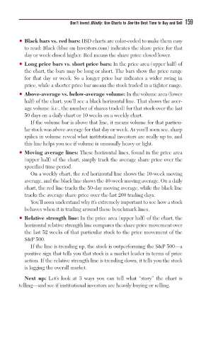
• Black bars vs. red bars: IBD charts are color-coded to make them easy
to read: Black (blue on Investors.com) indicates the share price for that
day or week closed higher. Red means the share price closed lower.
• Long price bars vs. short price bars: In the price area (upper half) of
the chart, the bars may be long or short. The bars show the price range
for that day or week. So a longer price bar indicates a wider swing in
price, while a shorter price bar means the stock traded in a tighter range.
• Above-average vs. below-average volume: In the volume area (lower
half) of the chart, you’ll see a black horizontal line. That shows the aver-
age volume (i.e., the number of shares traded) for that stock over the last
50 days on a daily chart or 10 weeks on a weekly chart.
If the volume bar is above that line, it means volume for that particu-
lar stock was above average for that day or week. As you’ll soon see, sharp
spikes in volume reveal what institutional investors are really up to, and
this line helps you see if volume is unusually heavy or light.
• Moving average lines: These horizontal lines, found in the price area
(upper half) of the chart, simply track the average share price over the
specified time period.
On a weekly chart, the red horizontal line shows the 10-week moving
average, and the black line shows the 40-week moving average. On a daily
chart, the red line tracks the 50-day moving average, while the black line
tracks the average share price over the last 200 trading days.
You’ll soon understand why it’s extremely important to see how a stock
behaves when it is trading around these benchmark lines.
• Relative strength line: In the price area (upper half) of the chart, the
horizontal relative strength line compares the share price movement over
the last 52 weeks of that particular stock to the price movement of the
S&P 500.
If the line is trending up, the stock is outperforming the S&P 500—a
positive sign that tells you that stock is a market leader in terms of price
action. If the relative strength line is trending down, it tells you the stock
is lagging the overall market.
Next up: Let’s look at 3 ways you can tell what “story” the chart is
telling—and see if institutional investors are heavily buying or selling.