
Page 22 - MODULE QUALITY TOOLS DMQ 30262
P. 22
DMQ 30262
2.5 SCATTER DIAGRAM
The scatter diagram or scatter plot is used to examine the relationships
between variables. These relationships are sometimes used to identify
indicator variables in organizations. For example, in a hospital, the
postoperative infection rate has been found to be associated with many
different factors such as the sterile procedure used by the doctors and nurses,
cleanliness of the operation rooms, and sterile procedures in handling the
utensils used in surgery. Therefore, the postoperative infection rate is an
important variable in the hospital quality measurement.
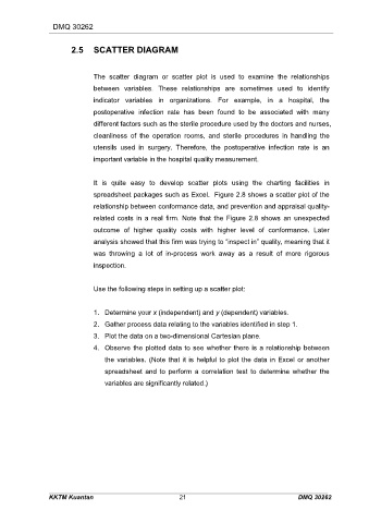
It is quite easy to develop scatter plots using the charting facilities in
spreadsheet packages such as Excel. Figure 2.8 shows a scatter plot of the
relationship between conformance data, and prevention and appraisal quality-
related costs in a real firm. Note that the Figure 2.8 shows an unexpected
outcome of higher quality costs with higher level of conformance. Later
analysis showed that this firm was trying to “inspect in” quality, meaning that it
was throwing a lot of in-process work away as a result of more rigorous
inspection.
Use the following steps in setting up a scatter plot:
1. Determine your x (independent) and y (dependent) variables.
2. Gather process data relating to the variables identified in step 1.
3. Plot the data on a two-dimensional Cartesian plane.
4. Observe the plotted data to see whether there is a relationship between
the variables. (Note that it is helpful to plot the data in Excel or another
spreadsheet and to perform a correlation test to determine whether the
variables are significantly related.)
KKTM Kuantan 21 DMQ 30262