Page 58 - Applied Statistics with R
P. 58

58                                CHAPTER 4. SUMMARIZING DATA
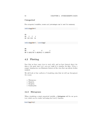

                                 Categorical

                                 For categorical variables, counts and percentages can be used for summary.

                                 table(mpg$drv)


                                 ##
                                 ##   4    f   r
                                 ## 103 106   25


                                 table(mpg$drv) / nrow(mpg)


                                 ##
                                 ##          4         f          r
                                 ## 0.4401709 0.4529915 0.1068376


                                 4.2 Plotting


                                 Now that we have some data to work with, and we have learned about the
                                 data at the most basic level, our next tasks is to visualize the data. Often, a
                                 proper visualization can illuminate features of the data that can inform further
                                 analysis.

                                 We will look at four methods of visualizing data that we will use throughout
                                 the course:


                                    • Histograms
                                    • Barplots
                                    • Boxplots
                                    • Scatterplots


                                 4.2.1   Histograms


                                 When visualizing a single numerical variable, a histogram will be our go-to
                                 tool, which can be created in R using the hist() function.

                                 hist(mpg$cty)
   53   54   55   56   57   58   59   60   61   62   63