
Page 2 - Before & After magazine | 0269 | What's the right typeface for text?
P. 2
BAmagazine.com i U X
Before&After ®
What’s the right typeface for text?
For text that’s smooth, clear and readable, the operative word is medium
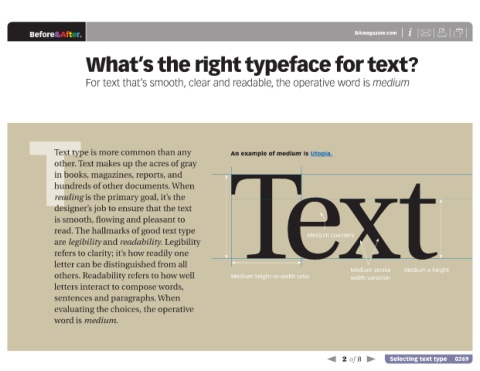
T An example of medium is Utopia.
Text type is more common than any
other. Text makes up the acres of gray
in books, magazines, reports, and
hundreds of other documents. When
reading is the primary goal, it’s the
designer’s job to ensure that the text Text
is smooth, flowing and pleasant to
read. The hallmarks of good text type
Medium counters
are legibility and readability. Legibility
refers to clarity; it’s how readily one
letter can be distinguished from all
Medium stroke Medium x-height
others. Readability refers to how well Medium height-to-width ratio width variation
letters interact to compose words,
sentences and paragraphs. When
evaluating the choices, the operative
word is medium.
2 of 8 Selecting text type 0269