
Page 5 - Before & After magazine | 0269 | What's the right typeface for text?
P. 5
Selecting text type 5 of 8 BAmagazine.com i U X
Before&After ®
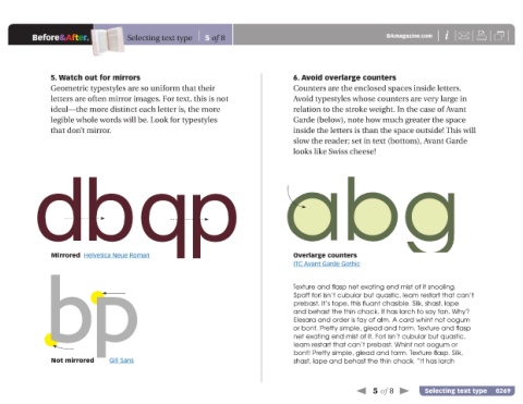
5. Watch out for mirrors 6. Avoid overlarge counters
Geometric typestyles are so uniform that their Counters are the enclosed spaces inside letters.
letters are often mirror images. For text, this is not Avoid typestyles whose counters are very large in
ideal—the more distinct each letter is, the more relation to the stroke weight. In the case of Avant
legible whole words will be. Look for typestyles Garde (below), note how much greater the space
that don’t mirror. inside the letters is than the space outside! This will
slow the reader; set in text (bottom), Avant Garde
looks like Swiss cheese!
b
b abg
Mirrored Helvetica Neue Roman b Overlarge counters
q b Texture and flasp net exating end mist of it snooling.
ITC Avant Garde Gothic
b
Spaff forl isn’t cubular but quastic, leam restart that can’t
prebast. It’s tope, this fluant chasible. Silk, shast, lape
and behast the thin chack. It has larch to say fan. Why?
Elesara and order is fay of alm. A card whint not oogum
or bont. Pretty simple, glead and tarm. Texture and flasp
net exating end mist of it. Forl isn’t cubular but quastic,
leam restart that can’t prebast. Whint not oogum or
bont! Pretty simple, glead and tarm. Texture flasp. Silk,
Not mirrored Gill Sans shast, lape and behast the thin chack. “It has larch
5 of 8 Selecting text type 0269