
Page 3 - Before & After magazine | 0269 | What's the right typeface for text?
P. 3
Selecting text type 3 of 8 BAmagazine.com i U X
Before&After ®
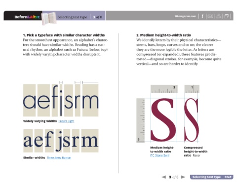
1. Pick a typeface with similar character widths 2. Medium height-to-width ratio
For the smoothest appearance, an alphabet’s charac- We identify letters by their physical characteristics—
ters should have similar widths. Reading has a nat- stems, bars, loops, curves and so on; the clearer
ural rhythm; an alphabet such as Futura (below, top) they are the more legible the letter. As letters are
with widely varying character widths disrupts it. compressed (or expanded), these features get dis-
torted—diagonal strokes, for example, become quite
vertical—and so are harder to identify.
aefjsrm 3 1
Widely varying widths Futura Light 5SS
aef jsrm
Medium height- Compressed
to-width ratio height-to-width
ITC Stone Serif ratio Racer
Similar widths Times New Roman
3 of 8 Selecting text type 0269