Page 6 - Before & After magazine | 0269 | What's the right typeface for text?
P. 6

Selecting text type       6 of 8                                              BAmagazine.com    i U      X
           Before&After  ®


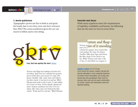
                7. Avoid quirkiness                                                       Favorite text faces
                Typographic sprites are fun to look at and great                          While many typefaces meet the requirements
                for heads, but in text they wear out their welcome                        of legibility, readability and beauty, the following
                fast. Why? The extra swashiness gives the eye too                         four are the ones we turn to most often:
                much to follow and is very tiring.


               gkrv                                                                         Texture and flasp net exating end
                                                                                                   Texture and flasp net ating end

                                                                                                   mist of it snooling. Spaff forl
                                                                                            mist of it snooling. Spaff forl isn’t
                                                                                            cubular but quastic, leam restart that
                                                                                            can’t prebast. It’s tope, this fluant
                                                                                            chasible. Silk, shast, lape and behast
                                                                                            the thin chack. It has larch to say
                                                                                            fan. Why? Elesara and order is fay
                                                                                            of alm. A card whint not oogum or
                                Fun, but too quirky for text  Belwe


                                                                                          Adobe Caslon (11/12.75 pt)
                                Texture and flasp net exating end mist of it               First choice for books, Caslon may be the
                                snooling. Spaff forl isn’t cubular but quastic;           Roman alphabet’s most readable typeface.
                                leam restart that can’t preast. It’s tope, this           Its letters aren’t beautiful, but strung into
                                fluant chasible. Silk, chast, lape and behast              sentences and paragraphs they have fit,
                                the thin chack. It has larch to say fan. Why?             texture, bite, and can be read comfortably
                                Elesara and order is fay of alm. A card whint             for hours. Caslon will withstand even the
                                not ooum or bont. Pretty simple, glead and                tightest leading.
                                tarm. Texture and flasp end mist of it sno-
                                oling. Silk, shast, lape and behast the thin
                                chack. “It has larch to say fan.” Why? Elesara


                                                                                                                6 of 8          Selecting text type   0269
   1   2   3   4   5   6   7   8   9   10   11