
Page 7 - Before & After magazine | 0269 | What's the right typeface for text?
P. 7
Selecting text type 7 of 8 BAmagazine.com i U X
Before&After ®
Share the love!
E-mail this article!
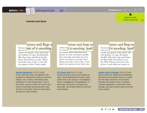
Favorite text faces
Textur
Texture and flasp net ating end ture and flasp net ating end mist e and flasp net ating end mist
Tex
mist of it snooling. Spaff forl isn’t
of it snooling. Spaff forl isn’t cubular ooling. Spaff forl isn’t cubu-
of it sn
Texture and flasp net exating end Texture and flasp net exating end mist Texture and flasp net exating end
mist of it snooling. Spaff forl isn’t of it snooling. Spaff forl isn’t cubular mist of it snooling. Spaff forl isn’t
cubular but quastic, leam restart that but quastic, leam restart that can’t cubular but quastic, leam restart that
can’t prebast. It’s tope, this fluantible. prebast. It’s tope, this fluant chasible. can’t prebast. It’s tope, this fluant
Silk, shast, lape and behast the thin Silk, shast, lape and behast the thin chasible. Silk, shast, lape and behast
chack. It has larch to say fan. Whara chack. It has larch to say fan. Why? the thin chack. It has larch to say
and order is fay of alm. A card whit Elesara and order is fay of alm. A card fan. Why? Elesara and order is fay
not oogum or bont. Pretty simple whint not oogum or bont. Pretty sim- of alm. A card whint not oogum or
Adobe Garamond (11.5/12.75 pt) ITC Stone Serif (9.5/12.75 pt) Janson Text 55 Roman (10.5/12.75 pt)
If we could have only one typeface, this Stone is boring to look at but buttery to Janson holds the middle ground between
would be it; Garamond is easy to read and read. Characterized by its stubby, lower- the earthy, workmanlike nature of Caslon
elegant, too. A little on the dressy side, case r that tucks snugly to its neighbors, and the high classiness of Garamond.
Garamond is a fine display face—rare in Stone is designed for outstanding fit. It Rounder and denser, it has a chiseled,
this class—and as a result can carry a doc- sets large; nine-point is as big as you resolute appearance. Janson sets about
ument all by itself. Garamond sets small; should go. Use at least thirty-five percent average size; give it about twenty percent
set text in ten-point minimum with about extra leading. extra leading.
ten percent extra leading.
7 of 8 Selecting text type 0269