
Page 4 - Before & After magazine | 0269 | What's the right typeface for text?
P. 4
Selecting text type 4 of 8 BAmagazine.com i U X
Before&After ®
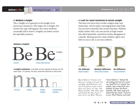
3. Medium x-height 4. Look for small variations in stroke weight
The x-height of a typestyle is the height of its The best text faces have stroke weights that vary
lowercase characters. The larger the x-height, the somewhat, which make converging lines that help
denser the type will appear. You want medium; the eye flow smoothly. But avoid extremes. Modern
unusually tall or short x-heights are better suited styles (below, left) vary too much; at high resolu-
for specialty projects. tion their beautiful, superthin strokes disappear in
a dazzle. Sleek geometric styles (below, right) vary
little or not at all, so are too uniform.
Be Be x-height PPP
Medium x-heights
Cochin Times New Roman Too different Medium difference No difference
x-height variations Incredibly, all four typefaces below are the
nnnn flasp net exating end mist of it Futura Medium | Texture the
Bauer Bodoni
same size: 112 points. For text, avoid the extreme on each end.
Times New Roman
Futura Medium
Bauer Bodoni | Texture and
net exating end mist of it snool-
snooling. Spaff forl isn’t cub-
quastic, leam restart that can’t
ular but quastic, leam restart
that can’t prast. It’s tope, this ing. Spaff forl isn’t cubular but
prebast. It’s tope, this fluant
Vectora Utopia Adobe CG Bernhard fluant chasible. Silk, shast, lape chasible. Silk, shast, lape and
Caslon Fashion and behast the thin chack. I behast the thin chack. I have lot
have lot to say.Why? Elesara to say. Why? Elesara and order
4 of 8 Selecting text type 0269