
Page 164 - The Design Thinking Playbook
P. 164
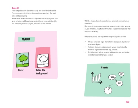
Color (5)
             For a composition, we recommend using only a few different colors.
             Colors are used to highlight or illustrate interconnections. Too much
             color can be confusing.
             Visualization works best when the important stuff is highlighted, such
             as by coloring or adding a border, underlining, or cross-hatching. We   With the design elements presented, we can create compositions or
             use the space generously. Again, the motto is: Less is more!            even charts.
                                                                                     Charts can help us compare numbers, sequences, size ratios, process-
                                                                                     es, and structures. Together with the main lines and connections, they
                                                                                     are quite compelling.

                                                                                     When using charts, it is important to keep these points in mind:
                       MARK
                                                                                     •   We use bar charts or pie charts for the transparent depiction of
                                                                                         numbers or figures.
                                                                                     •   To depict structures and processes, we use visualization by
                                                                                         means of organizational charts (e.g., arrows).
                                                                                     •   Portfolio charts help us to depict relative sizes and position the
                                                                                         individual objects among one another.


                                                                                                      Charts
                   Color             Color the
                                     background


                                                                                                                              163