
Page 55 - TCS ICT Book 5
P. 55
The City School 2021-2022
2.7. Representing Data in PowerPoint
A chart is a tool you can use to communicate
data graphically. Including a chart in a
presentation allows your audience to see the
meaning behind the numbers, which makes it Presenting Your Ideas
easy to visualize comparisons and trends.
Chart Types in Excel
PowerPoint has many different types of charts, allowing you to choose the one
that best fits your data. To use charts effectively, you will need to understand how
different charts are used.
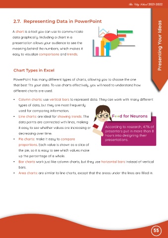
• Column charts: use vertical bars to represent data. They can work with many different
types of data, but they are most frequently
used for comparing information.
• Line charts: are ideal for showing trends. The
data points are connected with lines, making
it easy to see whether values are increasing or According to research, 47% of
decreasing over time. presenters put in more than 8
hours into designing their
• Pie charts: make it easy to compare presentations.
proportions. Each value is shown as a slice of
the pie, so it is easy to see which values make
up the percentage of a whole.
• Bar charts work just like column charts, but they use horizontal bars instead of vertical
bars.
• Area charts: are similar to line charts, except that the areas under the lines are filled in.
55