
Page 513 - Python Data Science Handbook
P. 513
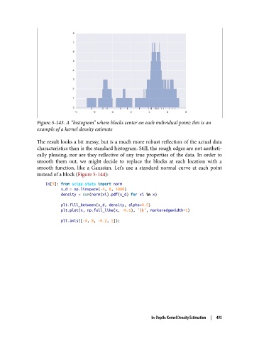
Figure 5-143. A “histogram” where blocks center on each individual point; this is an
               example of a kernel density estimate


               The result looks a bit messy, but is a much more robust reflection of the actual data
               characteristics than is the standard histogram. Still, the rough edges are not aestheti‐
               cally pleasing, nor are they reflective of any true properties of the data. In order to
               smooth them out, we might decide to replace the blocks at each location with a
               smooth function, like a Gaussian. Let’s use a standard normal curve at each point
               instead of a block (Figure 5-144):

                   In[9]: from scipy.stats import norm
                          x_d = np.linspace(-4, 8, 1000)
                          density = sum(norm(xi).pdf(x_d) for xi in x)
                          plt.fill_between(x_d, density, alpha=0.5)
                          plt.plot(x, np.full_like(x, -0.1), '|k', markeredgewidth=1)

                          plt.axis([-4, 8, -0.2, 5]);


                                                            In-Depth: Kernel Density Estimation  |  495