
Page 866 - MARSIUM'21 COMP OF PAPER
P. 866
867
4.1 Observation Checklist Result
The number in each column of the abbreviation represents the number of young visitors who said yes, with a total of 15 respondents for each
website. Tables 5, 6, 7, and 8 display the results of the observation checklist completed for Zoo Negara (ZNEG) and Chester Zoo (ZCHE).
4.1.1 Website Features of Zoo Negara and Chester Zoo Website
This section assessed how well the website features were perceived by the young visitors in terms of each of the website features attributes
listed including design, information quality, and also interactivity. It gathered a variety of findings from 15 respondents on a variety of
website designs for both websites. The young visitors were asked 11 website features-related questions. For analysis and better understanding,
the results in Table 4.4 to Table 4.7 are color-coded in three major colors: red (lower result), green (higher result), and yellow (link result).
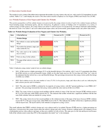
Table 4.4: Website Design Evaluation of Zoo Negara and Chester Zoo Websites.
Item Criteria/Survey ZNEG Percent (n=15) ZCHE Percent (n=15)
Website Design
WD1 The website is a nice and beautiful 7 46.7% 14 93.3%
design.
WD2 The website has pictures, maps, and 11 73.3% 11 73.3%
videos about the zoo.
WD3 The color used on the website is 7 46.7% 13 86.7%
nice to look at.
WD4 Fonts are okay for the website. 10 66.7% 13 86.7%
WD4 The page of the website is clear and 10 66.7% 13 86.7%
simple.
Table 4.4 indicates young visitors’ point of view on website design:
• WD1: ZCHE receives a higher percentage (93.3) on the beautiful design of the website, with 14 out of 15 respondents describing
the ZCHE website as a nice and beautiful design. ZNEG, on the other hand, receives (46.7%) less than half of the "yes" votes on
the statement that the website has a nice and beautiful design. This percentage demonstrates that young visitors prefer the design
of ZCHE over ZNEG.
• WD2: Both websites receive the same number of votes (73.3%) for the pictures, maps, and videos about each zoo, indicating that
both websites provide such information.
• WD3: The color used in ZCHE is preferred by the majority of young visitors, with 86.7 percent preferring it over ZNEG (46.7
percent). This percentage demonstrates that young visitors prefer the color used on ZCHE over ZNEG.
• WD4: The young visitors do not have much problem with the website in terms of the font used, because ZCHE websites receive
86.7% of the font used, while ZNEG receives 66.7%. This indicates that neither website has a significant problem with the font
used. Both websites' fonts are suitable for young visitors.
• WD5: The young visitors do not have much problem on the website in terms of the page of the layout because ZCHE websites
receive 86.7% of the type of page used, while ZNEG receives 66.7%. This indicates that neither website has a significant problem
with the layout used. The layout used by both websites is acceptable to young visitors.
This result indicates that ZNEG's website's design and color scheme need to be updated. Because ZCHE receives a higher percentage on
both items, it demonstrates that young visitors enjoy the website's design and color scheme. However, nothing needs to be changed in terms
of information such as videos, photos, and maps, as these are available on both websites. The same goes for the font and layout used because
both of the websites receive more than 50% of the respondent who stated “yes” to the statement.
867