
Page 425 - Applied Statistics with R
P. 425
17.2. BINARY RESPONSE 425
That is, type = "link" will get you the log odds, while type = "response"
will return the estimated mean, in this case, [ = 1 ∣ X = x] for each
observation.
plot(y ~ x, data = example_data,
pch = 20, ylab = "Estimated Probability",
main = "Ordinary vs Logistic Regression")
grid()
abline(fit_lm, col = "darkorange")
curve(predict(fit_glm, data.frame(x), type = "response"),
add = TRUE, col = "dodgerblue", lty = 2)
legend("topleft", c("Ordinary", "Logistic", "Data"), lty = c(1, 2, 0),
pch = c(NA, NA, 20), lwd = 2, col = c("darkorange", "dodgerblue", "black"))
Ordinary vs Logistic Regression
1.0 Ordinary
Logistic
0.8
Data
Estimated Probability 0.6 0.4
0.0 0.2
-2 -1 0 1
x
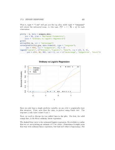
Since we only have a single predictor variable, we are able to graphically show
this situation. First, note that the data, is plotted using black dots. The
response y only takes values 0 and 1.
Next, we need to discuss the two added lines to the plot. The first, the solid
orange line, is the fitted ordinary linear regression.
The dashed blue curve is the estimated logistic regression. It is helpful to realize
that we are not plotting an estimate of for either. (Sometimes it might seem
that way with ordinary linear regression, but that isn’t what is happening.) For