
Page 192 - Python Data Science Handbook
P. 192
Example: Birthrate Data
As a more interesting example, let’s take a look at the freely available data on births in
the United States, provided by the Centers for Disease Control (CDC). This data can
be found at https://raw.githubusercontent.com/jakevdp/data-CDCbirths/master/
births.csv (this dataset has been analyzed rather extensively by Andrew Gelman and
his group; see, for example, this blog post):
In[10]:
# shell command to download the data:
# !curl -O https://raw.githubusercontent.com/jakevdp/data-CDCbirths/
# master/births.csv
In[11]: births = pd.read_csv('births.csv')
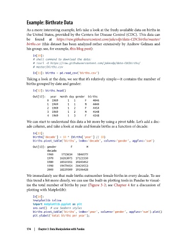
Taking a look at the data, we see that it’s relatively simple—it contains the number of
births grouped by date and gender:
In[12]: births.head()
Out[12]: year month day gender births
0 1969 1 1 F 4046
1 1969 1 1 M 4440
2 1969 1 2 F 4454
3 1969 1 2 M 4548
4 1969 1 3 F 4548
We can start to understand this data a bit more by using a pivot table. Let’s add a dec‐
ade column, and take a look at male and female births as a function of decade:
In[13]:
births['decade'] = 10 * (births['year'] // 10)
births.pivot_table('births', index='decade', columns='gender', aggfunc='sum')
Out[13]: gender F M
decade
1960 1753634 1846572
1970 16263075 17121550
1980 18310351 19243452
1990 19479454 20420553
2000 18229309 19106428
We immediately see that male births outnumber female births in every decade. To see
this trend a bit more clearly, we can use the built-in plotting tools in Pandas to visual‐
ize the total number of births by year (Figure 3-2; see Chapter 4 for a discussion of
plotting with Matplotlib):
In[14]:
%matplotlib inline
import matplotlib.pyplot as plt
sns.set() # use Seaborn styles
births.pivot_table('births', index='year', columns='gender', aggfunc='sum').plot()
plt.ylabel('total births per year');
174 | Chapter 3: Data Manipulation with Pandas