
Page 195 - Python Data Science Handbook
P. 195
Another interesting view is to plot the mean number of births by the day of the year.
Let’s first group the data by month and day separately:
In[20]:
births_by_date = births.pivot_table('births',
[births.index.month, births.index.day])
births_by_date.head()
Out[20]: 1 1 4009.225
2 4247.400
3 4500.900
4 4571.350
5 4603.625
Name: births, dtype: float64
The result is a multi-index over months and days. To make this easily plottable, let’s
turn these months and days into a date by associating them with a dummy year vari‐
able (making sure to choose a leap year so February 29th is correctly handled!)
In[21]: births_by_date.index = [pd.datetime(2012, month, day)
for (month, day) in births_by_date.index]
births_by_date.head()
Out[21]: 2012-01-01 4009.225
2012-01-02 4247.400
2012-01-03 4500.900
2012-01-04 4571.350
2012-01-05 4603.625
Name: births, dtype: float64
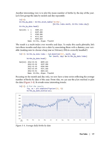
Focusing on the month and day only, we now have a time series reflecting the average
number of births by date of the year. From this, we can use the plot method to plot
the data (Figure 3-4). It reveals some interesting trends:
In[22]: # Plot the results
fig, ax = plt.subplots(figsize=(12, 4))
births_by_date.plot(ax=ax);
Figure 3-4. Average daily births by date
Pivot Tables | 177