
Page 345 - Python Data Science Handbook
P. 345
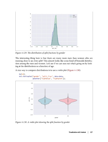
Figure 4-129. The distribution of split fractions by gender

               The interesting thing here is that there are many more men than women who are
               running close to an even split! This almost looks like some kind of bimodal distribu‐
               tion among the men and women. Let’s see if we can suss out what’s going on by look‐
               ing at the distributions as a function of age.
               A nice way to compare distributions is to use a violin plot (Figure 4-130):

                   In[34]:
                   sns.violinplot("gender", "split_frac", data=data,
                                  palette=["lightblue", "lightpink"]);


               Figure 4-130. A violin plot showing the split fraction by gender


                                                                 Visualization with Seaborn  |  327