
Page 342 - Python Data Science Handbook
P. 342
Out[27]: age gender split final split_sec final_sec
0 33 M 01:05:38 02:08:51 3938.0 7731.0
1 32 M 01:06:26 02:09:28 3986.0 7768.0
2 31 M 01:06:49 02:10:42 4009.0 7842.0
3 38 M 01:06:16 02:13:45 3976.0 8025.0
4 31 M 01:06:32 02:13:59 3992.0 8039.0
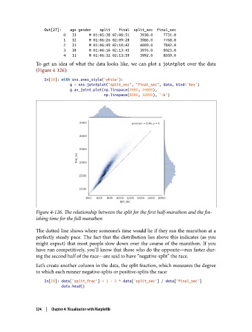
To get an idea of what the data looks like, we can plot a jointplot over the data
(Figure 4-126):
In[28]: with sns.axes_style('white'):
g = sns.jointplot("split_sec", "final_sec", data, kind='hex')
g.ax_joint.plot(np.linspace(4000, 16000),
np.linspace(8000, 32000), ':k')
Figure 4-126. The relationship between the split for the first half-marathon and the fin
ishing time for the full marathon
The dotted line shows where someone’s time would lie if they ran the marathon at a
perfectly steady pace. The fact that the distribution lies above this indicates (as you
might expect) that most people slow down over the course of the marathon. If you
have run competitively, you’ll know that those who do the opposite—run faster dur‐
ing the second half of the race—are said to have “negative-split” the race.
Let’s create another column in the data, the split fraction, which measures the degree
to which each runner negative-splits or positive-splits the race:
In[29]: data['split_frac'] = 1 - 2 * data['split_sec'] / data['final_sec']
data.head()
324 | Chapter 4: Visualization with Matplotlib