
Page 346 - Python Data Science Handbook
P. 346
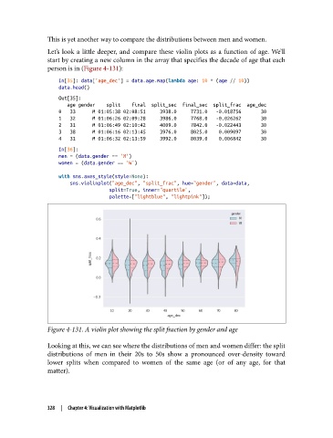
This is yet another way to compare the distributions between men and women.

               Let’s look a little deeper, and compare these violin plots as a function of age. We’ll
               start by creating a new column in the array that specifies the decade of age that each
               person is in (Figure 4-131):

                   In[35]: data['age_dec'] = data.age.map(lambda age: 10 * (age // 10))
                   data.head()
                   Out[35]:
                      age gender    split    final  split_sec  final_sec  split_frac  age_dec
                   0   33      M 01:05:38 02:08:51     3938.0     7731.0   -0.018756       30
                   1   32      M 01:06:26 02:09:28     3986.0     7768.0   -0.026262       30
                   2   31      M 01:06:49 02:10:42     4009.0     7842.0   -0.022443       30
                   3   38      M 01:06:16 02:13:45     3976.0     8025.0    0.009097       30
                   4   31      M 01:06:32 02:13:59     3992.0     8039.0    0.006842       30
                   In[36]:
                   men = (data.gender == 'M')
                   women = (data.gender == 'W')

                   with sns.axes_style(style=None):
                       sns.violinplot("age_dec", "split_frac", hue="gender", data=data,
                                     split=True, inner="quartile",
                                     palette=["lightblue", "lightpink"]);


               Figure 4-131. A violin plot showing the split fraction by gender and age

               Looking at this, we can see where the distributions of men and women differ: the split
               distributions of men in their 20s to 50s show a pronounced over-density toward
               lower splits when compared to women of the same age (or of any age, for that
               matter).


               328  |  Chapter 4: Visualization with Matplotlib