
Page 343 - Python Data Science Handbook
P. 343
Out[29]: age gender split final split_sec final_sec split_frac
0 33 M 01:05:38 02:08:51 3938.0 7731.0 -0.018756
1 32 M 01:06:26 02:09:28 3986.0 7768.0 -0.026262
2 31 M 01:06:49 02:10:42 4009.0 7842.0 -0.022443
3 38 M 01:06:16 02:13:45 3976.0 8025.0 0.009097
4 31 M 01:06:32 02:13:59 3992.0 8039.0 0.006842
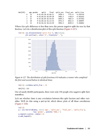
Where this split difference is less than zero, the person negative-split the race by that
fraction. Let’s do a distribution plot of this split fraction (Figure 4-127):
In[30]: sns.distplot(data['split_frac'], kde=False);
plt.axvline(0, color="k", linestyle="--");
Figure 4-127. The distribution of split fractions; 0.0 indicates a runner who completed
the first and second halves in identical times
In[31]: sum(data.split_frac < 0)
Out[31]: 251
Out of nearly 40,000 participants, there were only 250 people who negative-split their
marathon.
Let’s see whether there is any correlation between this split fraction and other vari‐
ables. We’ll do this using a pairgrid, which draws plots of all these correlations
(Figure 4-128):
In[32]:
g = sns.PairGrid(data, vars=['age', 'split_sec', 'final_sec', 'split_frac'],
hue='gender', palette='RdBu_r')
g.map(plt.scatter, alpha=0.8)
g.add_legend();
Visualization with Seaborn | 325