
Page 344 - Python Data Science Handbook
P. 344
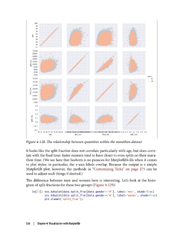
Figure 4-128. The relationship between quantities within the marathon dataset

               It looks like the split fraction does not correlate particularly with age, but does corre‐
               late with the final time: faster runners tend to have closer to even splits on their mara‐
               thon time. (We see here that Seaborn is no panacea for Matplotlib’s ills when it comes
               to plot styles: in particular, the x-axis labels overlap. Because the output is a simple
               Matplotlib plot, however, the methods in “Customizing Ticks” on page 275  can be
               used to adjust such things if desired.)
               The difference between men and women here is interesting. Let’s look at the histo‐
               gram of split fractions for these two groups (Figure 4-129):

                   In[33]: sns.kdeplot(data.split_frac[data.gender=='M'], label='men', shade=True)
                           sns.kdeplot(data.split_frac[data.gender=='W'], label='women', shade=True)
                           plt.xlabel('split_frac');


               326  |  Chapter 4: Visualization with Matplotlib