
Page 363 - Python Data Science Handbook
P. 363
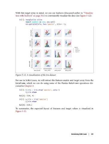
With this target array in mind, we can use Seaborn (discussed earlier in “Visualiza‐
               tion with Seaborn” on page 311) to conveniently visualize the data (see Figure 5-12):

                   In[2]: %matplotlib inline
                          import seaborn as sns; sns.set()
                          sns.pairplot(iris, hue='species', size=1.5);


               Figure 5-12. A visualization of the Iris dataset

               For use in Scikit-Learn, we will extract the features matrix and target array from the
               DataFrame, which we can do using some of the Pandas DataFrame  operations dis‐
               cussed in Chapter 3:

                   In[3]: X_iris = iris.drop('species', axis=1)
                          X_iris.shape
                   Out[3]: (150, 4)
                   In[4]: y_iris = iris['species']
                          y_iris.shape
                   Out[4]: (150,)
               To summarize, the expected layout of features and target values is visualized in
               Figure 5-13.


                                                                   Introducing Scikit-Learn  |  345