
Page 403 - Math Smart - 7
P. 403
In this chapter
CHAPTER 17.2 Pupils should be able to:
• draw and interpret:
o pictograms
o bar-line graphs
o bar charts
o frequency diagrams
for grouped discrete
data
Graphs and charts are visual presentations of information. Data in a frequency o simple pie charts
table can be represented in different ways, such as pictograms, bar charts, • draw cone! usions based
bar-line graphs, frequency diagrams and pie charts. It is often easier to interpret on the shape of graphs
data shown as a graph or chart rather than in a table with many numbers, as we and simple statistics
can see and compare proportions or tell the trend in the data right away.
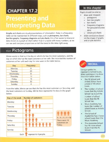
Pictograms
Mimie wants to find out the day on which she has the most customers, and the
day on which she has the least customers at her cafe. She recorded the number of
customers at her cafe each day for one week in the table below.
^ RECALL
Day Frequency
Monday S
Using a symbol to
Tuesday 20
represent 2 school buses,
Wednesday 8 draw a pictogram to show
Thursday 12 the information below.
Friday 16 • The RE School and
Saturday 32 Artistic School have
Sunday 4 a total of 10 school
buses.
From the table, Mimie can see that she has the most customers on Saturday, and • The number of school
the least customers on Sunday. Mimie then represents the data In the graph buses that the Artistic
the
of
below. School has is |
number of school
Day of the week Number of customers
buses that the RE
Monday IT School has.
• Music Academy has
f ttf i
Tuesday twice the number of
school buses as Artistic
Wednesday If School.
("ifii • The School of
Thursday tlHf Academics has 2 fewer
4 + 4 + 4 + 4 = 16
school buses than the
Friday Titir ' There were 16 Music Academy.
customers on
• The Awesome School
Saturday titll'il'iHr'll' Friday. has 10 more school
buses than the RE
Sunday f School.
Each represents 4 people.
399