
Page 418 - Math Smart - 7
P. 418
0 The frequency table shows the number of people in certain age categories participating in a Bingo
game in a retirement home.
Age In years 30 5 A- < 40 40£A<50 50sa<60 60 :S A < 70 70 £ A < 80 80 £ A < 90
Frequency 3 6 9 13 7 2
a) Represent the data in a suitable graph. Explain your choice.
b) How many people were surveyed?
c) How many people were in the age range 40-49?
d) Which was the most common age range?
e) How many more people were in the age range 50-59 than in the age range 80-89?
f) Which age range had the lowest frequency?
g) Give a possible reason as to why the frequency of the age range 80-89 is the lowest
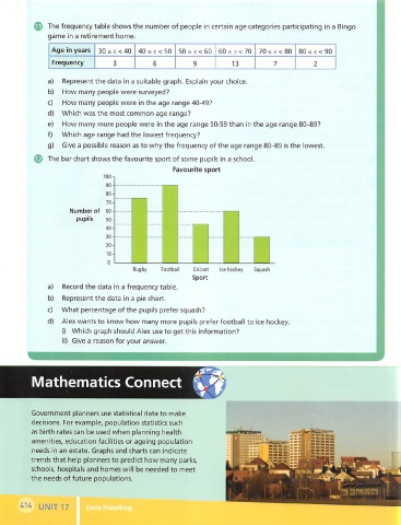
The bar chart shows the favourite sport of some pupils in a school.
Favourite sport
Number of 60-
Footba Cricket ice hockey
a) Record the data in a frequency table.
b) Represent the data in a pie chart.
C) What percentage of the pupils prefer squash?
d) Alex wants to know how many more pupils prefer football to ice hockey.
i) Which graph should Alex use to get this information?
ii) Give a reason for your answer.
5
Mathematics Connect
Government planners use statistical data to make
decisions. For example, population statistics such
as birth rates can be used when planning health
amenities, education facilities or ageing population
needs in an estate. Graphs and charts can indicate
trends that help planners to predict how many parks,
schools, hospitals and homes will be needed to meet
the needs of future populations.
UNIT 17