
Page 416 - Math Smart - 7
P. 416
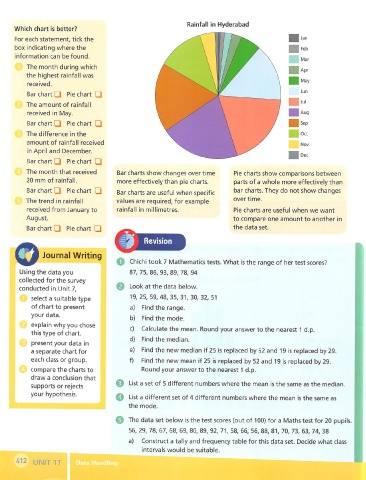
Rainfall In Hyderabad
      Which chart is better?
                                                                                                  I  Jan
      For each statement, tick the
      box indicating where the                                                                    I  Feb
      information can be found.
                                                                                                   Mar
          The month during which
                                                                                                  Apr
          the highest rainfall was
                                                                                                   May
          received.
          Bar chart □  Pie chart  □                                                               Jun
                                                                                                  I  Jul
          The amount of rainfall
          received  in  May.                                                                      i  Aug
          Bar chart Q  Pie chart  □                                                                Sep

          The difference in the                                                                   Get
          amount of rainfall  received                                                             Nov
          in April and  December.
                                                                                                   Dec
          Bar chart Q  Pie chart  Q
          The  month that received     Bar charts show changes over time     Pie charts show comparisons between
          20 mm of rainfall.           more effectively than pie charts.     parts of a whole more effectively than
          Bar chart Q  Pie chart  □    Bar charts are useful when specific   bar charts. They do not show changes
         The trend  in  rainfall       values are required, for example      overtime.
          received from January to     rainfall  in  millimetres.            Pie charts are useful when we want
         August.                                                             to compare one amount to another in
          Bar chart □  Pie chart  □                                          the data set.
                                                Revision
      O        Journal Writing         O  Chichi took 7 Mathematics tests. What is the range of her test scores?


       Using the data you                  87,  75,  86,  93,  89,  78,  94
       collected for the survey
       conducted  in  Unit 7,              Look at the data  below.
           select a suitable type          19,  25,  59, 48,35,31,30, 32,51
           of chart to present             a)  Find the range.
           your data.
                                           b)  Find the mode.
           explain why you chose           c)  Calculate the mean. Round your answer to the nearest 1  d.p.
           this type of chart,
                                           d)  Find the median.
           present your data  in
           a separate chart for            e)  Find the new median if 25 is  replaced by 52 and  19 is  replaced by 29.
           each class or group.            f)  Find the new mean if 25 is replaced by 52 and  19  is replaced by 29.
           compare the charts to               Round your answer to the nearest 1  d.p.
           draw a conclusion that
           supports or rejects         Q  List a set of 5 different numbers where the mean is the same as the median.
           your hypothesis.            O  List a different set of 4 different numbers where the mean is the same as

                                           the mode.
                                       e The data set below is the test scores (out of ICQ) for a Maths test for 20 pupils.
                                           56, 29,  78,  67, 68,  69, 80, 89, 92, 71,  58,  66,  56, 88, 81, 70, 73,  63,  74,  38
                                           a)  Construct a tally and frequency table for this data set.  Decide what class

                                               intervals would  be suitable.
      ^12  UNIT 17        Data Handiin
                                      I