
Page 14 - Computing Book 7
P. 14
Data Handling Class 7
Common Error Messages – Identify the cause of the error
If we do mistake while typing formulas. MS Excel will show you different types of errors relevant to
the mistake we have made in a formula.
The most common error messages are:
######
This “message” appears when the column is not wide enough to display all of its content. You can
correct it by increasing the width of the column to fit the content correctly.
#DIV/0!
This error message appears when you divide something by 0. You can correct it by changing the
divider in the function or formula so it is not zero or blank.
#NAME?
This error message appears when you have typed a wrong formula and MS Excel cannot recognize it.
You can correct it by typing the correct formula’s name.
#VALUE! Error
This error appears when your formula includes cells that contain text and numbers. You can correct
it by correcting data types.
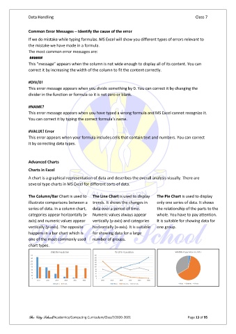
Advanced Charts
Charts in Excel
A chart is a graphical representation of data and describes the overall analysis visually. There are
several type charts in MS Excel for different sorts of data.
The Column/Bar Chart is used to The Line Chart is used to display The Pie Chart is used to display
illustrate comparisons between a trends. It shows the changes in only one series of data. It shows
series of data. In a column chart, data over a period of time. the relationship of the parts to the
categories appear horizontally (x- Numeric values always appear whole. You have to pay attention.
axis) and numeric values appear vertically (y-axis) and categories It is suitable for showing data for
vertically (y-axis). The opposite horizontally (x-axis). It is suitable one group.
happens in a bar chart which is for showing data for a large
one of the most commonly used number of groups.
chart types.
The City School/Academics/Computing Curriculum/Class7/2020-2021 Page 13 of 95