Page 274 - Applied Statistics with R
P. 274
274                             CHAPTER 13. MODEL DIAGNOSTICS


                                 The Wikipedia page for Normal probability plots gives details on how this is
                                 implemented in R if you are interested.


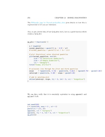
                                 Also, to get a better idea of how Q-Q plots work, here is a quick function which
                                 creates a Q-Q plot:


                                 qq_plot = function(e) {

                                   n = length(e)
                                   normal_quantiles = qnorm(((1:n - 0.5) / n))
                                   # normal_quantiles = qnorm(((1:n) / (n + 1)))

                                   # plot theoretical verus observed quantiles
                                   plot(normal_quantiles, sort(e),
                                        xlab = c("Theoretical Quantiles"),
                                        ylab = c("Sample Quantiles"),
                                        col = "darkgrey")
                                   title("Normal Q-Q Plot")

                                   # calculate line through the first and third quartiles
                                   slope      = (quantile(e, 0.75) - quantile(e, 0.25)) / (qnorm(0.75) - qnorm(0.25))
                                   intercept = quantile(e, 0.25) - slope * qnorm(0.25)

                                   # add to existing plot
                                   abline(intercept, slope, lty = 2, lwd = 2, col = "dodgerblue")
                                 }


                                 We can then verify that it is essentially equivalent to using qqnorm() and
                                 qqline() in R.


                                 set.seed(420)
                                 x = rnorm(100, mean = 0 , sd = 1)
                                 par(mfrow = c(1, 2))
                                 qqnorm(x, col = "darkgrey")
                                 qqline(x, lty = 2, lwd = 2, col = "dodgerblue")
                                 qq_plot(x)

