Page 276 - Applied Statistics with R
P. 276

276                             CHAPTER 13. MODEL DIAGNOSTICS


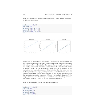
                                 Next, we simulate data from a    distribution with a small degrees of freedom,
                                 for different sample sizes.


                                 par(mfrow = c(1, 3))
                                 set.seed(420)
                                 qq_plot(rt(10, df = 4))
                                 qq_plot(rt(25, df = 4))
                                 qq_plot(rt(100, df = 4))


                                          Normal Q-Q Plot        Normal Q-Q Plot        Normal Q-Q Plot
                                                          4
                                   1.0                                           4
                                   0.5                    2                      2
                                  Sample Quantiles  0.0  -0.5  Sample Quantiles  0  Sample Quantiles  0

                                                          -2
                                   -1.0
                                                                                 -2
                                                          -4
                                   -1.5
                                     -1.5  -1.0  -0.5  0.0  0.5  1.0  1.5  -2  -1  0  1  2  -2  -1  0  1  2
                                          Theoretical Quantiles  Theoretical Quantiles  Theoretical Quantiles


                                 Recall, that as the degrees of freedom for a    distribution become larger, the
                                 distribution becomes more and more similar to a normal. Here, using 4 degrees
                                 of freedom, we have a distribution that is somewhat normal, it is symmetrical
                                 and roughly bell-shaped, however it has “fat tails.” This presents itself clearly
                                 in the third panel. While many of the points are close to the line, at the
                                 edges, there are large discrepancies. This indicates that the values are too
                                 small (negative) or too large (positive) compared to what we would expect for
                                 a normal distribution. So for the sample size of 100, we would conclude that
                                 that normality assumption is violated. (If these were residuals of a model.) For
                                 sample sizes of 10 and 25 we may be suspicious, but not entirely confident.
                                 Reading Q-Q plots, is a bit of an art, not completely a science.

                                 Next, we simulate data from an exponential distribution.


                                 par(mfrow = c(1, 3))
                                 set.seed(420)
                                 qq_plot(rexp(10))
                                 qq_plot(rexp(25))
                                 qq_plot(rexp(100))
   271   272   273   274   275   276   277   278   279   280   281