
Page 273 - Applied Statistics with R
P. 273
13.2. CHECKING ASSUMPTIONS 273
a rough bell shape, however, it also has a very sharp peak. For this reason we
will usually use more powerful tools such as Q-Q plots and the Shapiro-Wilk
test for assessing the normality of errors.
13.2.4 Q-Q Plots
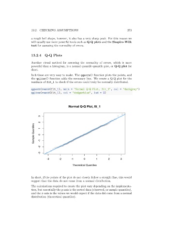
Another visual method for assessing the normality of errors, which is more
powerful than a histogram, is a normal quantile-quantile plot, or Q-Q plot for
short.
In R these are very easy to make. The qqnorm() function plots the points, and
the qqline() function adds the necessary line. We create a Q-Q plot for the
residuals of fit_1 to check if the errors could truly be normally distributed.
qqnorm(resid(fit_1), main = "Normal Q-Q Plot, fit_1", col = "darkgrey")
qqline(resid(fit_1), col = "dodgerblue", lwd = 2)
Normal Q-Q Plot, fit_1
3
2
Sample Quantiles 1 0
-2 -1
-3
-3 -2 -1 0 1 2 3
Theoretical Quantiles
In short, if the points of the plot do not closely follow a straight line, this would
suggest that the data do not come from a normal distribution.
The calculations required to create the plot vary depending on the implementa-
tion, but essentially the -axis is the sorted data (observed, or sample quantiles),
and the -axis is the values we would expect if the data did come from a normal
distribution (theoretical quantiles).