
Page 293 - Python Data Science Handbook
P. 293
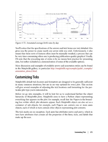
Figure 4-72. Annotated average birth rates by day

               You’ll notice that the specifications of the arrows and text boxes are very detailed: this
               gives you the power to create nearly any arrow style you wish. Unfortunately, it also
               means that these sorts of features often must be manually tweaked, a process that can
               be very time-consuming when one is producing publication-quality graphics! Finally,
               I’ll note that the preceding mix of styles is by no means best practice for presenting
               data, but rather included as a demonstration of some of the available options.
               More discussion and examples of available arrow and annotation styles can be found
               in the Matplotlib gallery, in particular http://matplotlib.org/examples/pylab_examples/
               annotation_demo2.html.

               Customizing Ticks


               Matplotlib’s default tick locators and formatters are designed to be generally sufficient
               in many common situations, but are in no way optimal for every plot. This section
               will give several examples of adjusting the tick locations and formatting for the par‐
               ticular plot type you’re interested in.
               Before we go into examples, it will be best for us to understand further the object
               hierarchy of Matplotlib plots. Matplotlib aims to have a Python object representing
               everything that appears on the plot: for example, recall that the figure is the bound‐
               ing box within which plot elements appear. Each Matplotlib object can also act as a
               container of sub-objects; for example, each figure  can contain one or more axes
               objects, each of which in turn contain other objects representing plot contents.
               The tick marks are no exception. Each axes has attributes xaxis and yaxis, which in
               turn have attributes that contain all the properties of the lines, ticks, and labels that
               make up the axes.


                                                                       Customizing Ticks  |  275