
Page 297 - Python Data Science Handbook
P. 297
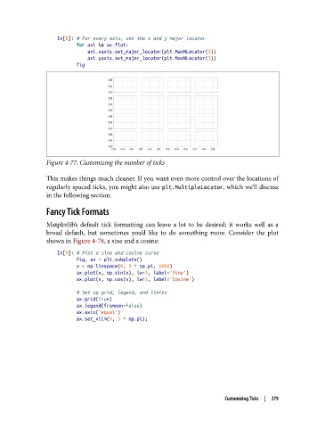
In[8]: # For every axis, set the x and y major locator
                          for axi in ax.flat:
                              axi.xaxis.set_major_locator(plt.MaxNLocator(3))
                              axi.yaxis.set_major_locator(plt.MaxNLocator(3))
                          fig


               Figure 4-77. Customizing the number of ticks


               This makes things much cleaner. If you want even more control over the locations of
               regularly spaced ticks, you might also use plt.MultipleLocator, which we’ll discuss
               in the following section.

               Fancy Tick Formats
               Matplotlib’s default tick formatting can leave a lot to be desired; it works well as a
               broad default, but sometimes you’d like to do something more. Consider the plot
               shown in Figure 4-78, a sine and a cosine:
                   In[9]: # Plot a sine and cosine curve
                          fig, ax = plt.subplots()
                          x = np.linspace(0, 3 * np.pi, 1000)
                          ax.plot(x, np.sin(x), lw=3, label='Sine')
                          ax.plot(x, np.cos(x), lw=3, label='Cosine')

                          # Set up grid, legend, and limits
                          ax.grid(True)
                          ax.legend(frameon=False)
                          ax.axis('equal')
                          ax.set_xlim(0, 3 * np.pi);


                                                                       Customizing Ticks  |  279