
Page 296 - Python Data Science Handbook
P. 296
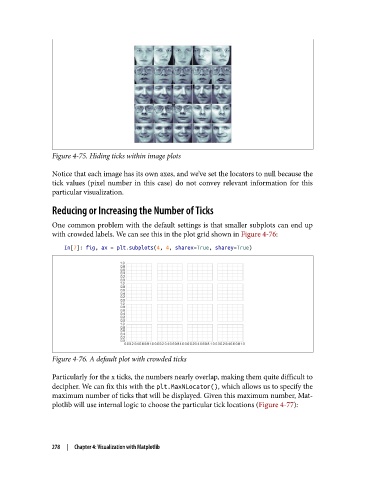
Figure 4-75. Hiding ticks within image plots

               Notice that each image has its own axes, and we’ve set the locators to null because the
               tick values (pixel number in this case) do not convey relevant information for this
               particular visualization.

               Reducing or Increasing the Number of Ticks

               One common problem with the default settings is that smaller subplots can end up
               with crowded labels. We can see this in the plot grid shown in Figure 4-76:
                   In[7]: fig, ax = plt.subplots(4, 4, sharex=True, sharey=True)


               Figure 4-76. A default plot with crowded ticks

               Particularly for the x ticks, the numbers nearly overlap, making them quite difficult to
               decipher. We can fix this with the plt.MaxNLocator(), which allows us to specify the
               maximum number of ticks that will be displayed. Given this maximum number, Mat‐
               plotlib will use internal logic to choose the particular tick locations (Figure 4-77):


               278  |  Chapter 4: Visualization with Matplotlib