
Page 288 - Python Data Science Handbook
P. 288
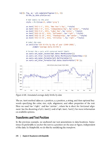
In[4]: fig, ax = plt.subplots(figsize=(12, 4))
                          births_by_date.plot(ax=ax)

                          # Add labels to the plot
                          style = dict(size=10, color='gray')
                          ax.text('2012-1-1', 3950, "New Year's Day", **style)
                          ax.text('2012-7-4', 4250, "Independence Day", ha='center', **style)
                          ax.text('2012-9-4', 4850, "Labor Day", ha='center', **style)
                          ax.text('2012-10-31', 4600, "Halloween", ha='right', **style)
                          ax.text('2012-11-25', 4450, "Thanksgiving", ha='center', **style)
                          ax.text('2012-12-25', 3850, "Christmas ", ha='right', **style)
                          # Label the axes
                          ax.set(title='USA births by day of year (1969-1988)',
                                 ylabel='average daily births')
                          # Format the x axis with centered month labels
                          ax.xaxis.set_major_locator(mpl.dates.MonthLocator())
                          ax.xaxis.set_minor_locator(mpl.dates.MonthLocator(bymonthday=15))
                          ax.xaxis.set_major_formatter(plt.NullFormatter())
                          ax.xaxis.set_minor_formatter(mpl.dates.DateFormatter('%h'));


               Figure 4-68. Annotated average daily births by date

               The ax.text method takes an x position, a y position, a string, and then optional key‐
               words specifying the color, size, style, alignment, and other properties of the text.
               Here we used ha='right'  and ha='center', where ha  is short for horizonal align‐
               ment. See the docstring of plt.text() and of mpl.text.Text() for more information
               on available options.

               Transforms and Text Position

               In the previous example, we anchored our text annotations to data locations. Some‐
               times it’s preferable to anchor the text to a position on the axes or figure, independent
               of the data. In Matplotlib, we do this by modifying the transform.


               270  |  Chapter 4: Visualization with Matplotlib