
Page 301 - Python Data Science Handbook
P. 301
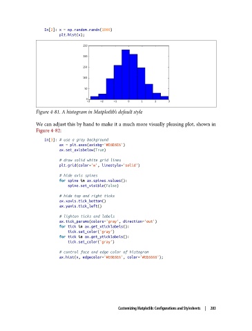
In[2]: x = np.random.randn(1000)
                          plt.hist(x);


               Figure 4-81. A histogram in Matplotlib’s default style

               We can adjust this by hand to make it a much more visually pleasing plot, shown in
               Figure 4-82:
                   In[3]: # use a gray background
                          ax = plt.axes(axisbg='#E6E6E6')
                          ax.set_axisbelow(True)

                          # draw solid white grid lines
                          plt.grid(color='w', linestyle='solid')
                          # hide axis spines
                          for spine in ax.spines.values():
                              spine.set_visible(False)
                          # hide top and right ticks
                          ax.xaxis.tick_bottom()
                          ax.yaxis.tick_left()

                          # lighten ticks and labels
                          ax.tick_params(colors='gray', direction='out')
                          for tick in ax.get_xticklabels():
                              tick.set_color('gray')
                          for tick in ax.get_yticklabels():
                              tick.set_color('gray')
                          # control face and edge color of histogram
                          ax.hist(x, edgecolor='#E6E6E6', color='#EE6666');


                                                Customizing Matplotlib: Configurations and Stylesheets  |  283