
Page 302 - Python Data Science Handbook
P. 302
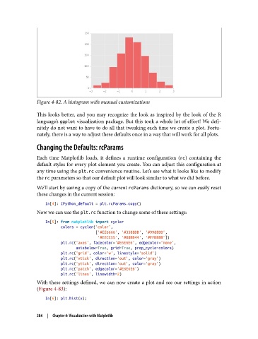
Figure 4-82. A histogram with manual customizations

               This looks better, and you may recognize the look as inspired by the look of the R
               language’s ggplot visualization package. But this took a whole lot of effort! We defi‐
               nitely do not want to have to do all that tweaking each time we create a plot. Fortu‐
               nately, there is a way to adjust these defaults once in a way that will work for all plots.

               Changing the Defaults: rcParams

               Each time Matplotlib loads, it defines a runtime configuration (rc) containing the
               default styles for every plot element you create. You can adjust this configuration at
               any time using the plt.rc convenience routine. Let’s see what it looks like to modify
               the rc parameters so that our default plot will look similar to what we did before.

               We’ll start by saving a copy of the current rcParams dictionary, so we can easily reset
               these changes in the current session:

                   In[4]: IPython_default = plt.rcParams.copy()
               Now we can use the plt.rc function to change some of these settings:

                   In[5]: from matplotlib import cycler
                          colors = cycler('color',
                                          ['#EE6666', '#3388BB', '#9988DD',
                                           '#EECC55', '#88BB44', '#FFBBBB'])
                          plt.rc('axes', facecolor='#E6E6E6', edgecolor='none',
                                 axisbelow=True, grid=True, prop_cycle=colors)
                          plt.rc('grid', color='w', linestyle='solid')
                          plt.rc('xtick', direction='out', color='gray')
                          plt.rc('ytick', direction='out', color='gray')
                          plt.rc('patch', edgecolor='#E6E6E6')
                          plt.rc('lines', linewidth=2)
               With these settings defined, we can now create a plot and see our settings in action
               (Figure 4-83):
                   In[6]: plt.hist(x);


               284  |  Chapter 4: Visualization with Matplotlib