
Page 318 - Python Data Science Handbook
P. 318
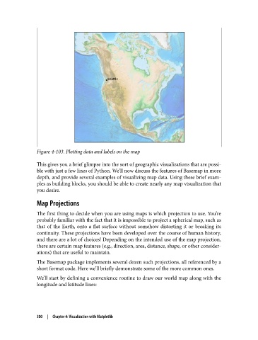
Figure 4-103. Plotting data and labels on the map

               This gives you a brief glimpse into the sort of geographic visualizations that are possi‐
               ble with just a few lines of Python. We’ll now discuss the features of Basemap in more
               depth, and provide several examples of visualizing map data. Using these brief exam‐
               ples as building blocks, you should be able to create nearly any map visualization that
               you desire.

               Map Projections

               The first thing to decide when you are using maps is which projection to use. You’re
               probably familiar with the fact that it is impossible to project a spherical map, such as
               that of the Earth, onto a flat surface without somehow distorting it or breaking its
               continuity. These projections have been developed over the course of human history,
               and there are a lot of choices! Depending on the intended use of the map projection,
               there are certain map features (e.g., direction, area, distance, shape, or other consider‐
               ations) that are useful to maintain.

               The Basemap package implements several dozen such projections, all referenced by a
               short format code. Here we’ll briefly demonstrate some of the more common ones.

               We’ll start by defining a convenience routine to draw our world map along with the
               longitude and latitude lines:


               300  |  Chapter 4: Visualization with Matplotlib